The challenge
Hundreds of SKUs presented as an undifferentiated grid. Customers couldn't assemble a room's worth of purchases, and the mobile experience buried category entry points.
The strategy
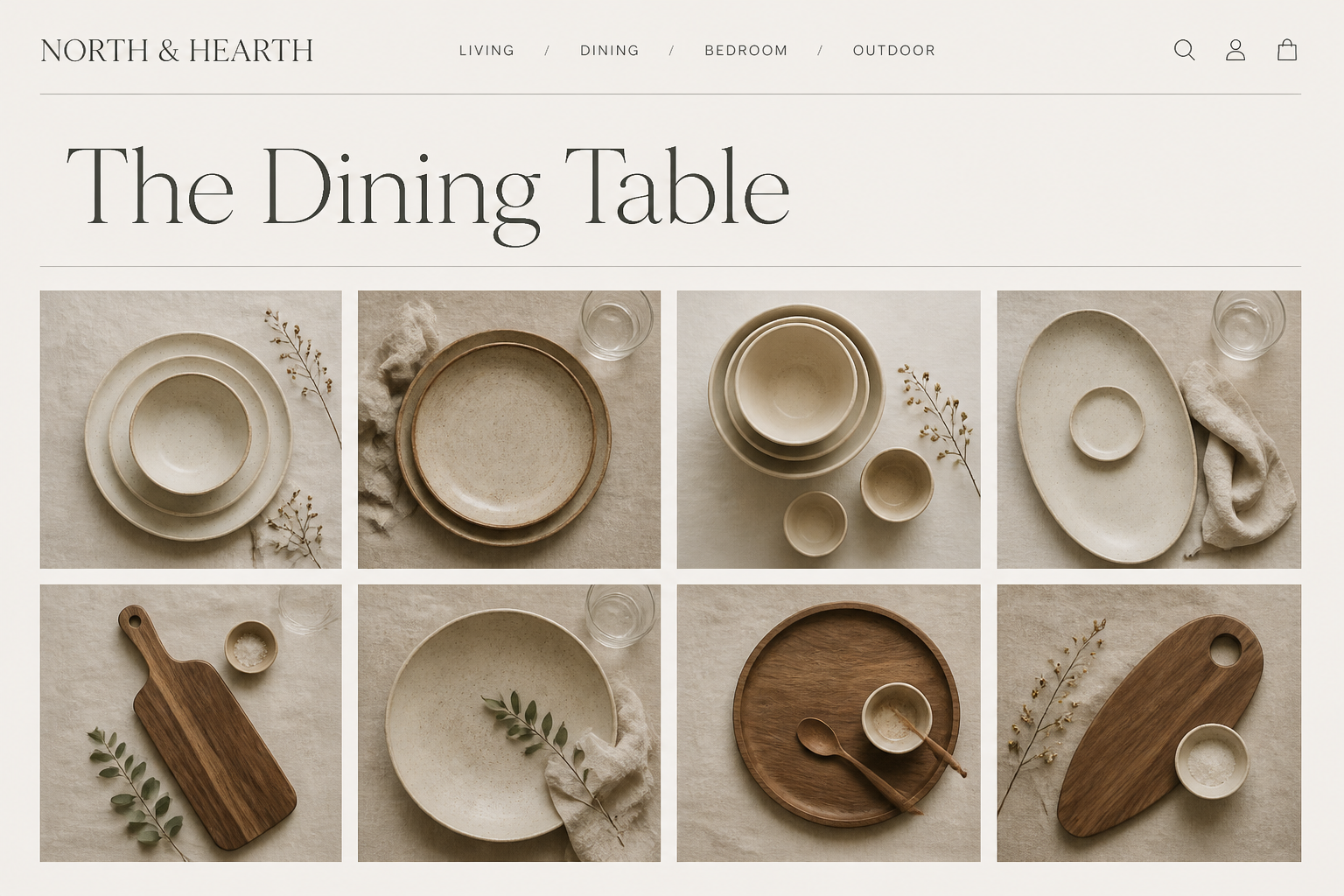
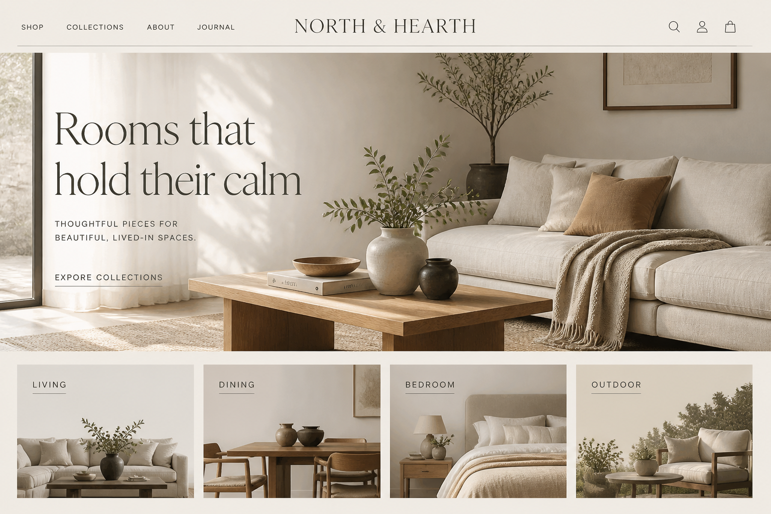
Organize by room and use-case, elevate photography, and make mobile the primary design surface rather than an afterthought.
What was implemented
- Room-first collection architecture
- Editorial imagery standards across listings
- Mobile-rebuilt navigation and filtering
- Merchandising rules for seasonal rotation
The outcome
Browsing now feels like furnishing — customers move through rooms rather than scrolling an endless catalog.
Outcomes are described qualitatively by design — no invented metrics. Where a store is live, judge it yourself by visiting.