The challenge
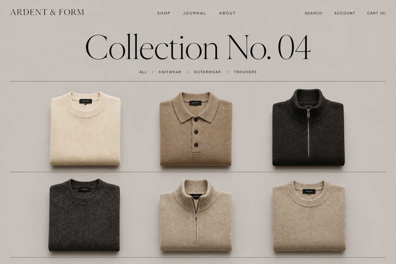
The collection photographed beautifully but the storefront flattened it: inconsistent product pages, a navigation that grouped garments by arrival date rather than how customers shop, and a checkout path interrupted by avoidable decisions.
The strategy
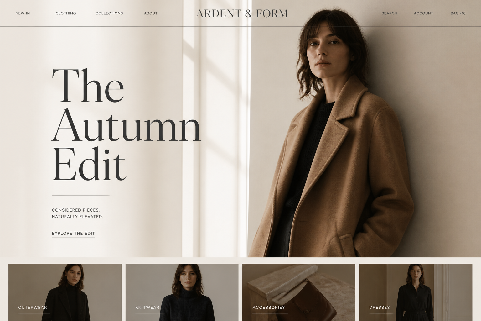
Let the product carry the page. Strip layouts back to type, whitespace and photography; rebuild collections around garment categories; and shorten the path from look to cart.
What was implemented
- Rebuilt collection architecture around garment categories
- Standardized product page templates and imagery ratios
- Simplified navigation and lookbook entry points
- Reduced checkout friction and cart abandonment points
The outcome
The store now feels like the label itself — restrained and confident — with a browsing rhythm that carries customers deeper into the collection.
Outcomes are described qualitatively by design — no invented metrics. Where a store is live, judge it yourself by visiting.