The challenge
Revolyse sells a grass-fed tallow and honey balm: a product shoppers need to understand and believe in before they buy. The storefront had to explain unfamiliar ingredients clearly, keep one hero product at the centre without feeling thin, give visitors simple ways to browse collections, and carry the same calm, clean feel from a first visit on desktop to a quick scroll on a phone.
The strategy
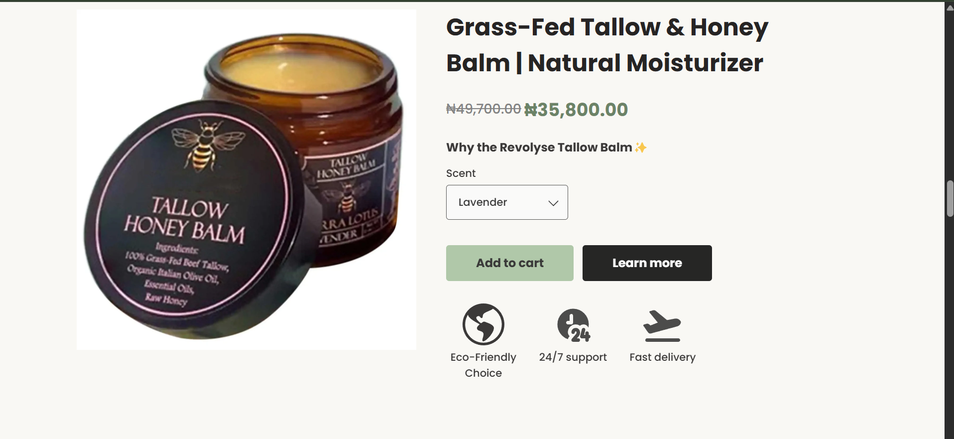
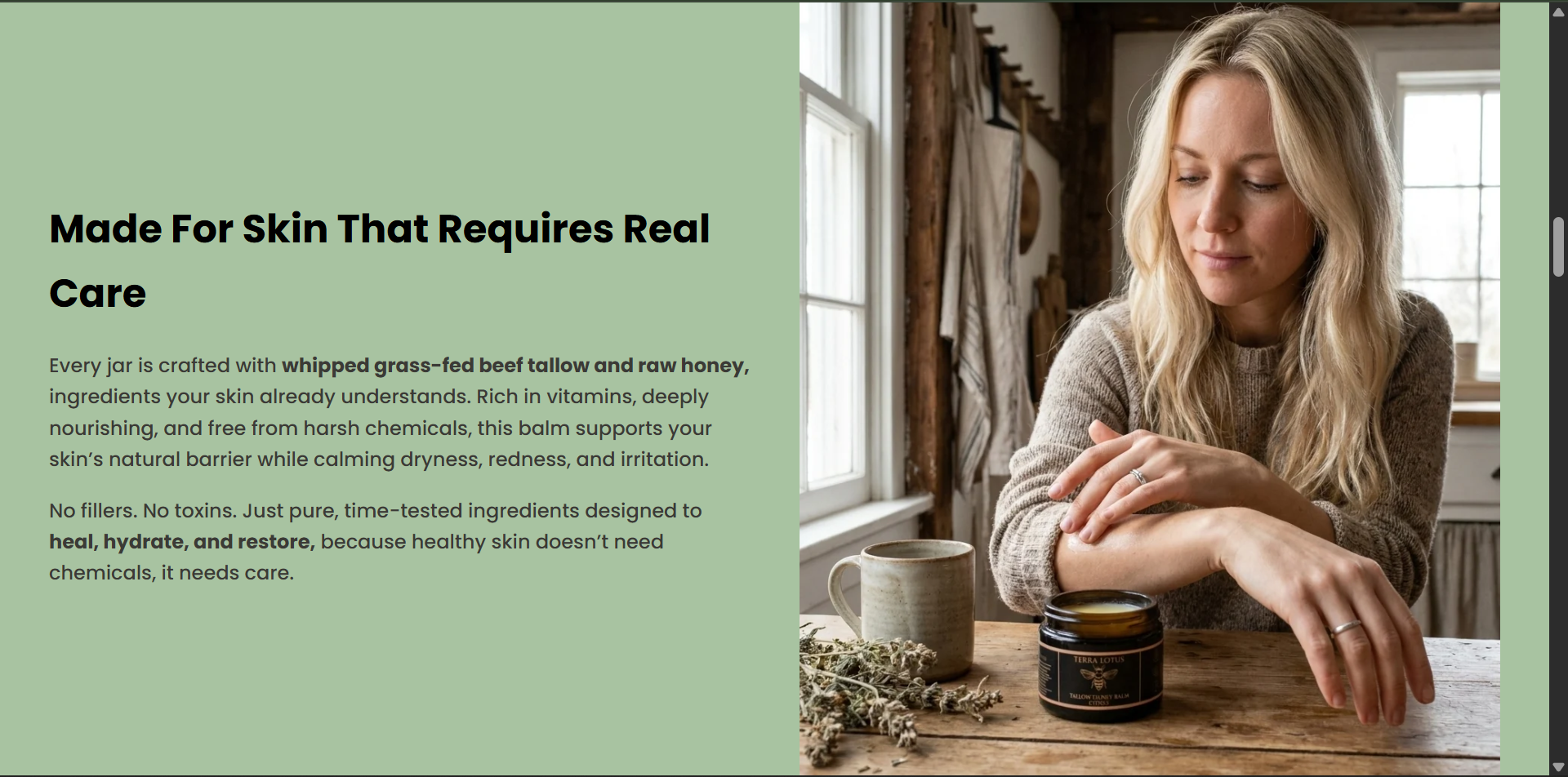
The site leads with the brand's promise and lets ingredients and real customers do the persuading. A soft sage palette and lifestyle imagery set a natural tone, a philosophy section explains the thinking, and the product page pairs price, scent choice and two clear actions with simple service icons. Benefit sections break the formula into short, scannable claims, while customer photos, written reviews and a welcome offer layer trust and a reason to start.
What was implemented
- Homepage structure with a brand-promise hero, announcement bar and Learn More / Shop Now calls to action
- Welcome pop-up offering 10% off a first order in exchange for an email address
- Brand philosophy section with a link into the full story
- Product presentation with sale pricing, scent selector, Add to cart and Learn more actions
- Service icons for eco-friendly choice, 24/7 support and fast delivery
- Circular collection navigation for Comfort, Hygiene and Protection
- Ingredient-led benefit sections — clean formulas, high-impact ingredients, backed by science
- Customer photo reviews, written review cards and a product review carousel
- Responsive layouts and a mobile menu across the full storefront
The outcome
The result is a focused, trustworthy storefront where one product carries the whole brand: visitors can understand what's in the balm, see real customer feedback and choose a scent without leaving a calm, consistent experience on any screen.
Outcomes are described qualitatively by design — no invented metrics. Where a store is live, judge it yourself by visiting.